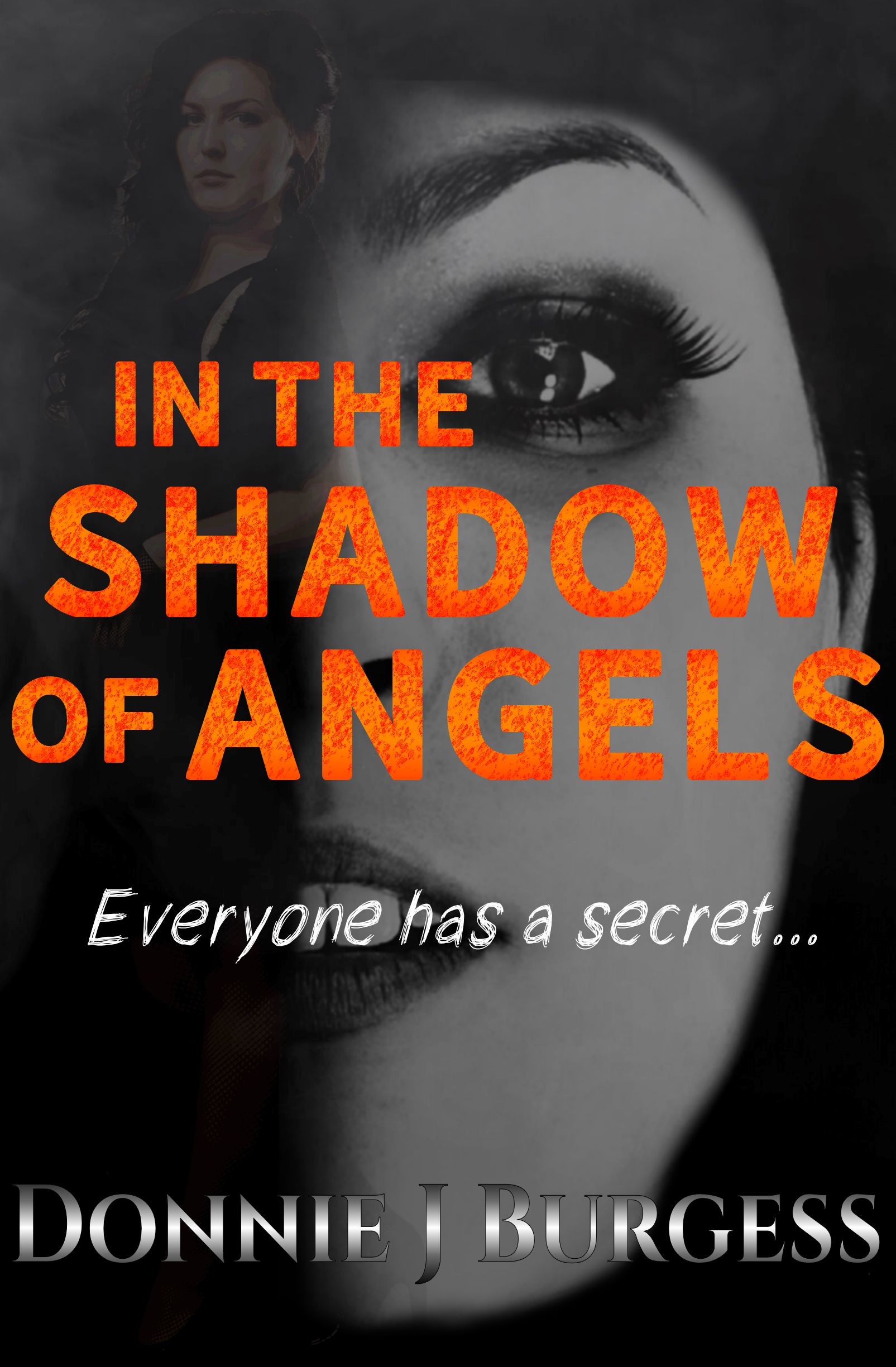
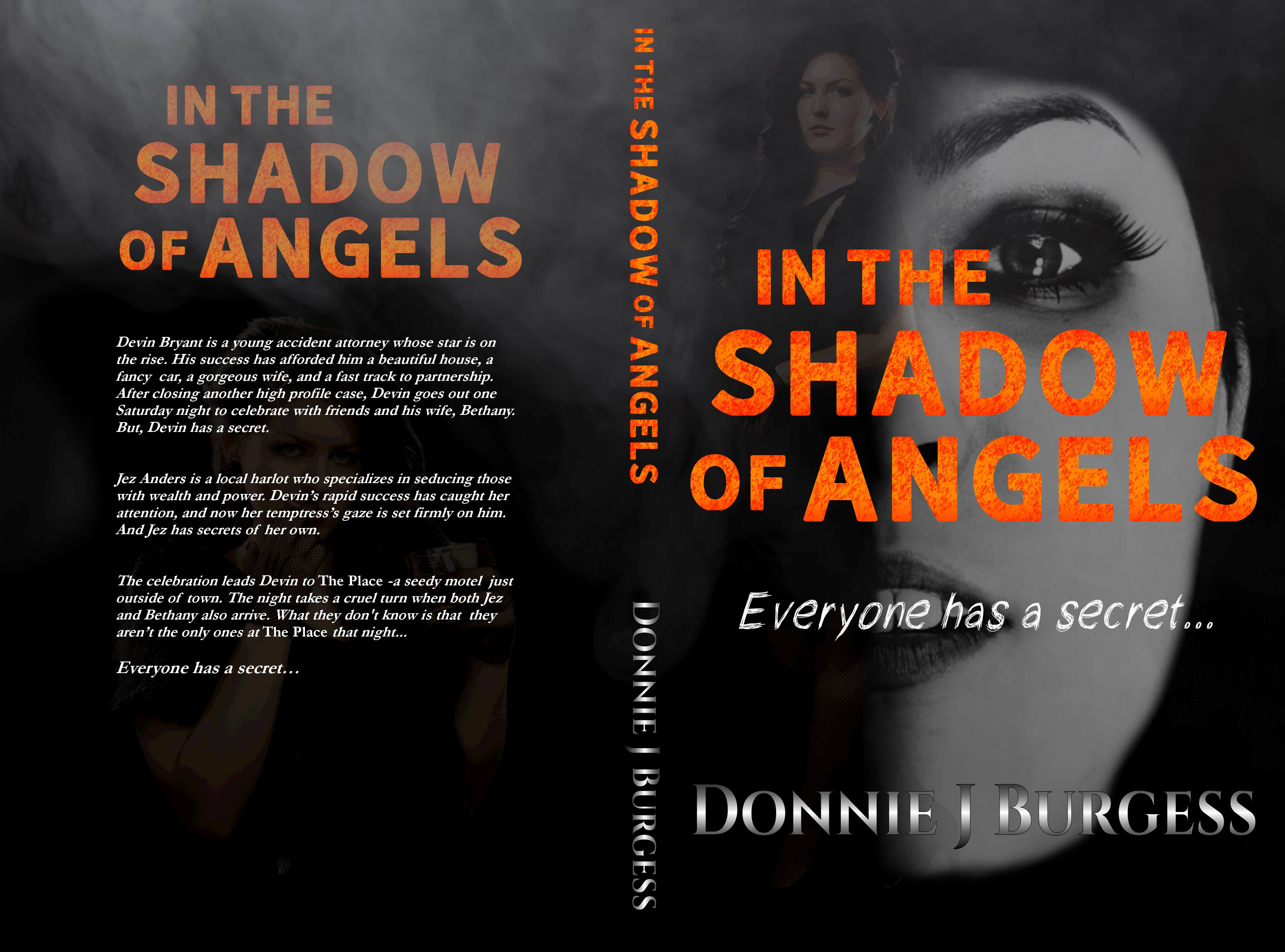
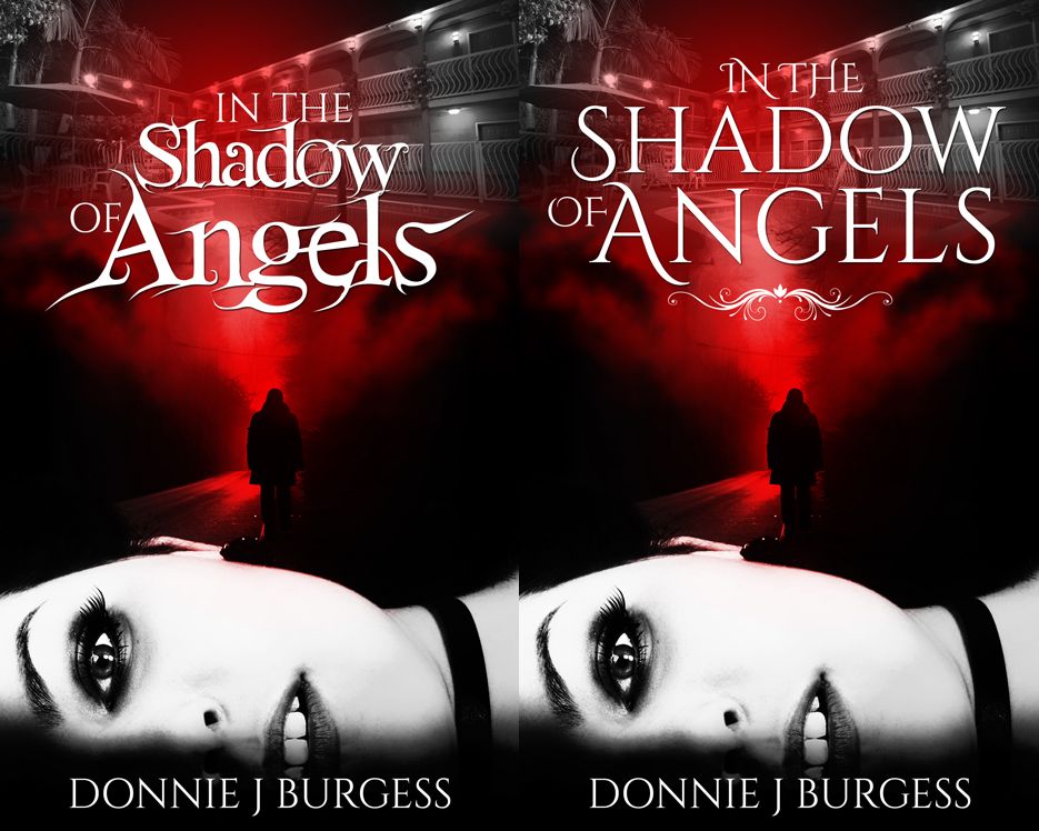
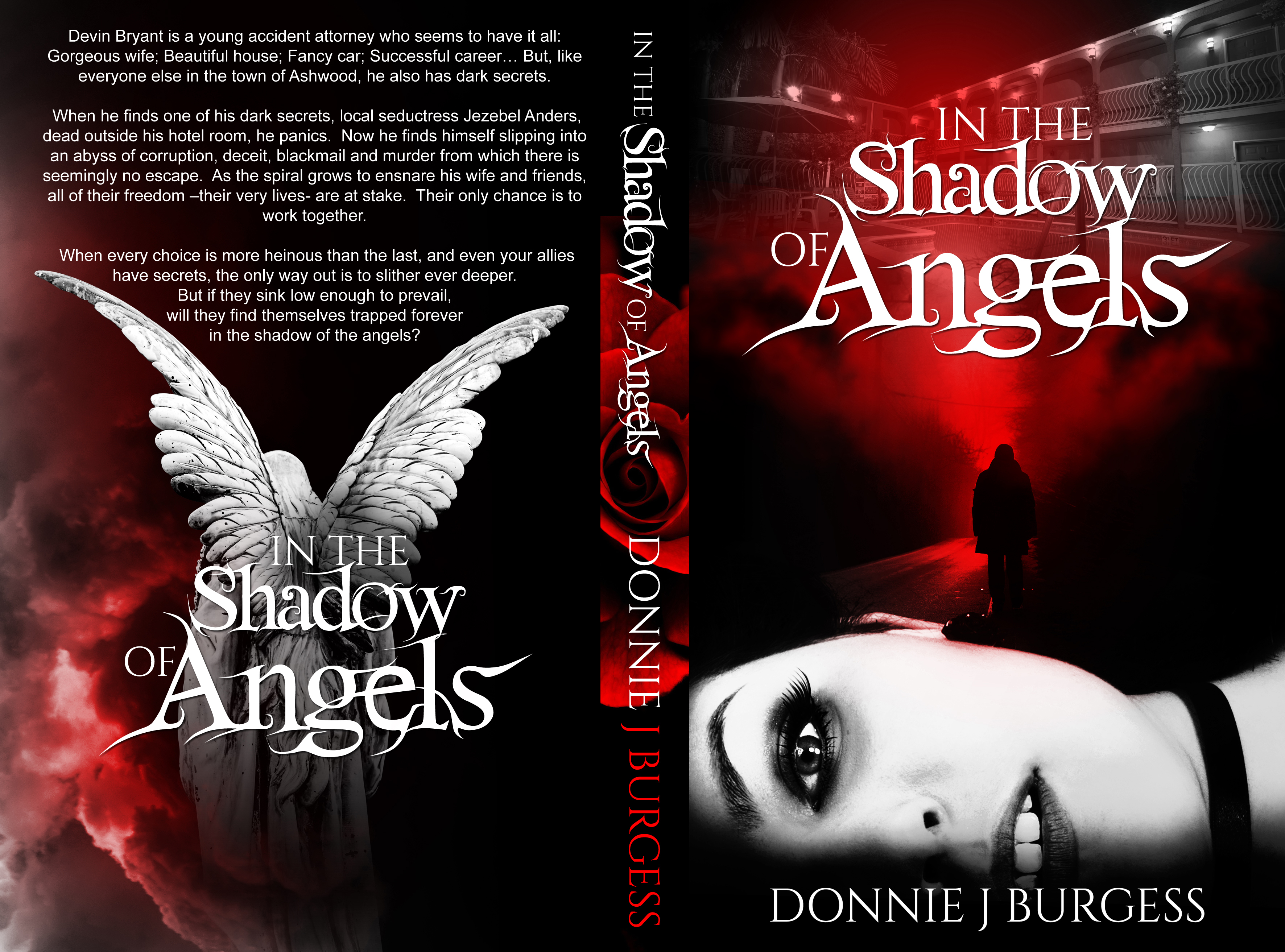
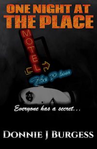
After much deliberation, a tremendous amount of input from friends and family, and countless hours, I’ve come up with a new look for In the Shadow of Angels (pictured here is the print version of said cover):
However. this cover came about slowly and evolved much over time. Just for fun, I’ve penned up a bit of a retrospective on the cover design. Click through if you’re interested to see it
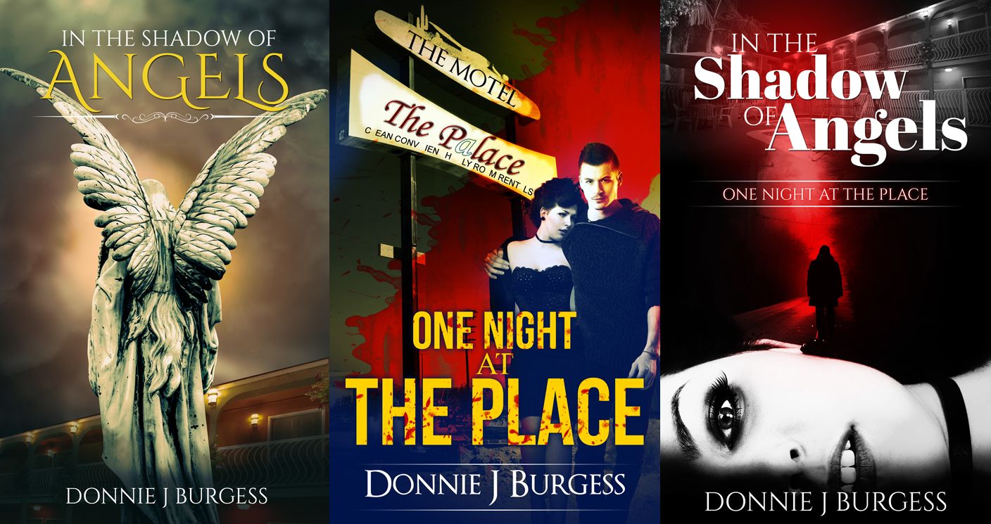
As I’ve detailed before, the current print of In the Shadow of Angels is nothing like the first draft. The ominous tone of the prologue continued throughout and it read much more like a pure suspense, or possibly horror/suspense, story. I used the term ‘Shadow of Angels’ as a metaphor for the duality of the primary character. When I ultimately scrapped that version and retained only the prologue, I was left with a question of what to call the story. The title In the Shadow of Angels fit the mood and tone of the original draft perfectly, but it didn’t really fit what the story became. The manuscript was titled “One Night at The Place”, which I did to save the title for a big reveal. I kind of liked the vague nature of that title, but I wasn’t sure which way to go.
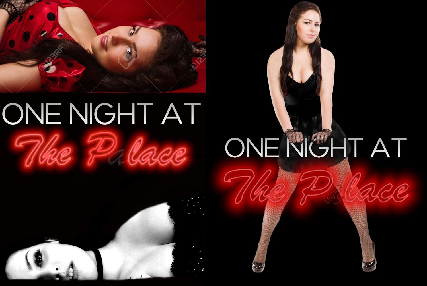
When it came time to design the cover art, I still hadn’t made up my mind about the title. I gave my cover designer the basic gist of the story, suggested a couple of concepts, gave him the picture of Jez that I had been working with, and gave him both titles to work with to see if one of the covers would grab me. I’ve never posted those initial concepts anywhere (and may not have the authority to do so), but for the sake of this post, I’ll do so now:
There were things I liked about each of the concepts, but also things I didn’t. I really liked the mournful appearance of the angel in the left photo (it became the back cover image of my first edition), the middle one had the hotel sign and a great hint at the genre, but the one on the right had the image of Jez I had sent him wonderfully portrayed at the bottom (you’ll also note that he added ‘One Night at The Place’ as a subtitle). I decided I liked that one the best, but I think I was basing that on thinking it ‘looked cool’ more than whether it was more suited to the book. Nonetheless, I sent him a few notes on it and had him flesh that one out:
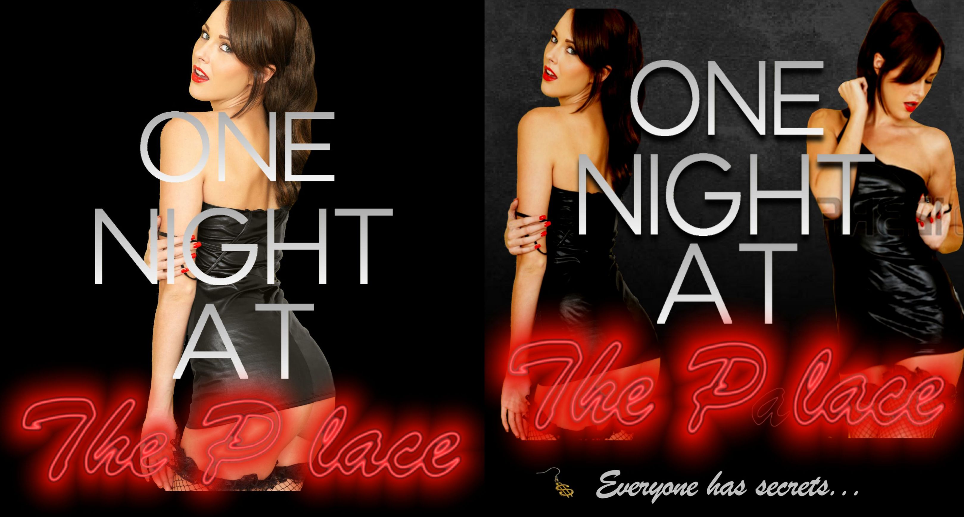
Still choosing for all the wrong reasons, I thought the text on the left cover looked cool as fuck, so I had him continue with that. He did an amazing job with it, and I still think this cover looks simply amazing:
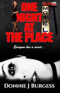
For a gothic, vampire-based novel, this thing was just amazing. The only problem is that I didn’t write a gothic, vampire-based novel. Not even close to it. Whether this had any effect on my sales (or lack thereof) is debatable. I think I was turning away anyone who wasn’t specifically looking for a vampire novel. Could I be wrong? Absolutely. But I decided to get him to tone down the gothic vampire-y aspect of it after the book had been in print for several months. The text was changed, the rose was removed from the spine, and it didn’t look quite as vampire-y:
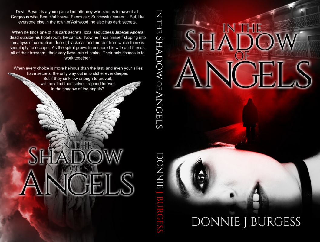
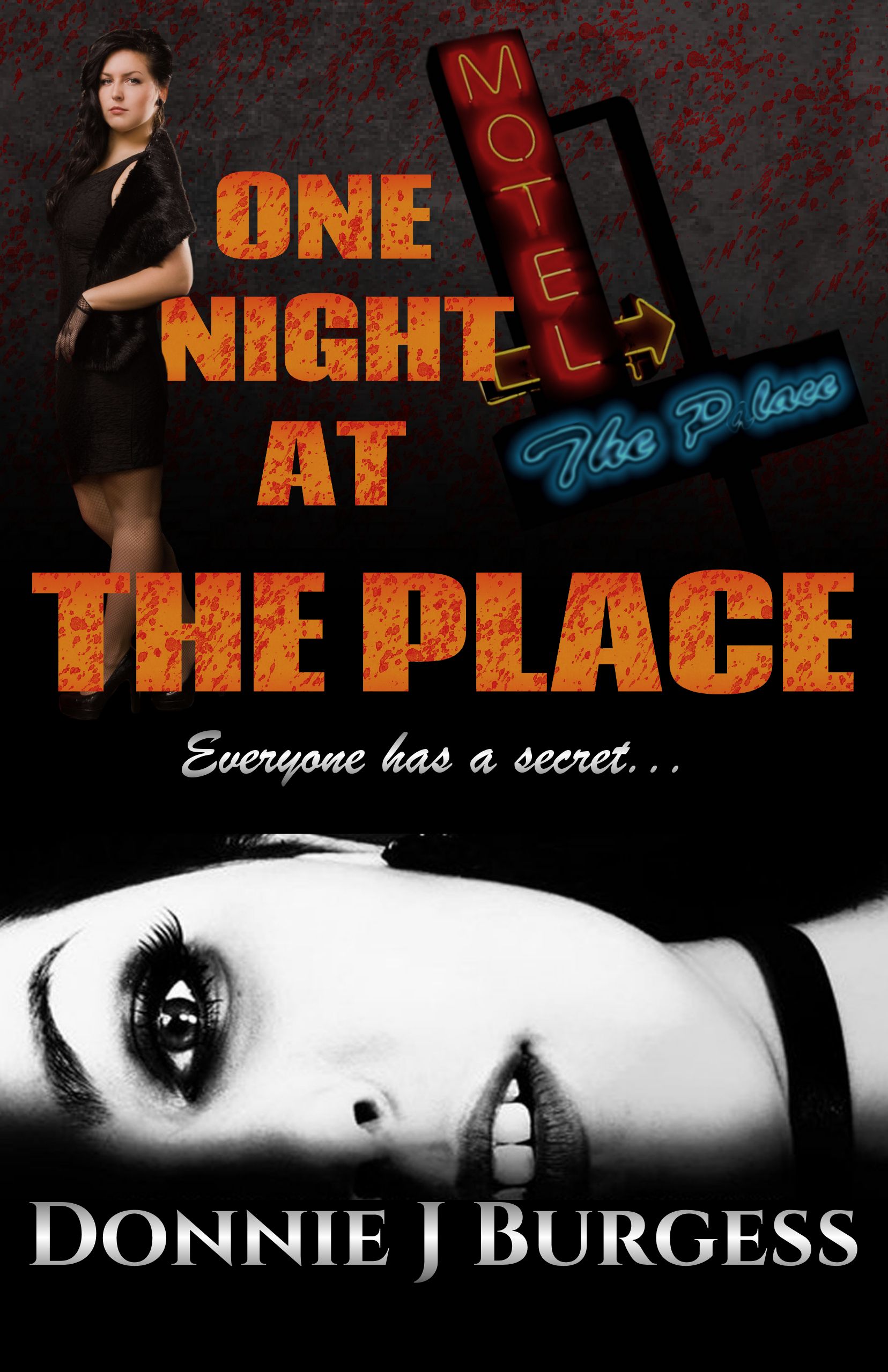
I think you’ll agree that removing the rose from the spine and going away from the ultra-goth looking text reduced the more blatant vampire associations. But with a dead girl on the cover, all the red, and the term ‘shadow of angels’ on the cover, I think it still hinted at it. The worst problem with this one wasn’t any of that, though. The worst problem was the text. The glowing text effects look great at full size on the computer screen. The look okay in print, but not nearly as crisp and sharp as the on screen rendering. The thumbnail, however, was just fucked.
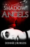 As much as Amazon wants to sell the book, they sure don’t act like it. Most of the places you will find the book cover show it at the size you see pictured here: way too goddamned small. Your first interaction with this image will almost certainly lead you to believe that the book is called “Shadow Angels”. So removing all the gothic, vampire-y stuff from it worked great in theory, but in practice it seemed to push it further in the direction of fake teeth and blood. Shadow Angels? How could that be anything but a vampire novel? If you were to click on the link (from the Amazon page, not from my thumbnail) it would have taken you to the book page. There, you would have seen a slightly larger version of the image where you could almost read the ‘in the’ and ‘of’ text as part of the title. Again, in theory, as no one ever actually clicked through.
I let that one stew for a few months before I started thinking about changing it. When I finally did, I was fairly certain that I didn’t want to change just the cover image, I wanted to change the title as well. I started mocking up some ideas of my own for the cover. My first thought (and first concept) was to use the same girl who provided the photo of the dead-eyed stare, but alive, as an image for the top half of the cover and the dead-eyed girl on the bottom. I wanted to move the title to the center to give it a focal point. The idea was; alive on the top, One Night at The Place, then dead on the bottom. The other idea was just to use the living girl and have the title on top of her. I hadn’t purchased the images at this point; they were just mock-ups:
The problem is that the girl who provided the image for the dead-eyed Jez is simply too wholesome. No matter how much I tried to slut her up (and trust me, I went to great lengths to try to slut her up on the right image), she just didn’t seem believable as Jez. That wasn’t the only problem, but I saw it as a primary one, so I tried to use a different girl to slut it up a bit. Here are a couple of attempts to use that concept, but with a sluttier girl:
Those who have read the book will know the significance of that dollar sign earring on the right image 🙂 Also in the right image, I added in the tag line “Everyone has secrets”, which I thought was very fitting to the story. I actually added it just because there was so much blank space, but it would become very serendipitous later. It was at this point in the cover design than I started asking people for input on the images. The input from these examples was that 1)it looked like it was probably erotica. 2) Women (my primary target audience) aren’t going to be swayed by having a girl’s ass hanging out on a book cover. 3) The glowing neon text (especially in thumbnail form) was not obviously part of the title. If you didn’t know that I was going to be calling it “One Night at The Place”, you would think the book title was “One Night at” based on the image. 4) The girl with the dead-eyed stare needed to be part of it (this was universal from all who provided feedback). All of that sounded absolutely true to me, so I hit the drawing board again.
It was at this point that I contacted Bruce Hartman for some advice. Bruce is an acquaintance I made after reviewing one of his books for Reader’s Favorite. He’s an all around nice guy who has provided me input on writing and advertising, and who I turned on to ACX to get one of his books on Audible (completely as an aside, one of the great things about indie authors is that the community is extremely helpful. I’ve yet to run into another indie who wouldn’t gladly share any portion of their knowledge or experience). He has a bunch of titles in print, some of which have hundreds of reviews, so, of the people I knew with any experience, I thought he might be able to provide me with some very useful insight. After providing Bruce with the nickel version of what you’ve read and seen so far, his advice was this: make it like the middle image from the initial concept: Noir and gritty. If I was to use the title “One Night at The Place”, I needed to also use a hotel sign to indicate it was an actual establishment and not just some vague term, and the typography of the title must all be in the same font. He did like the idea of having Jez both living and dead in the image, though, so I tried to find one where she wasn’t quite so apple-pie looking.
 Here is the mock-up I came up with factoring in all his advice. In this concept, I added the girl beside the title text, added a hotel sign with ‘The Place’ at the top of it (though it’s tough to see it in the thumb version), changed the typography to a font more suited to the genre and changed the tag line from the very vague ‘everyone has secrets’ to the more specific ‘everyone has a secret’. I thought the concept worked pretty well, and Bruce liked it well enough that I went ahead and put together a version with all those elements in a more aesthetically pleasing way:
I have to say that everything he suggested was spot on. That is a pretty amazing cover right there. I liked the way it looked well enough that I opened it up to criticism from a whole bunch of other people. I got that criticism in spades. The major criticisms were that the imagery made the cover ‘too busy’, that I shouldn’t use an actual photo for one of the characters and that it looked like a photo collage. I couldn’t discount any of those arguments outright.
 I wasn’t sure how to retain all the elements without it being busy and looking like a photo collage. I thought maybe I could move the title text to the top, like a more traditional book, and then maybe move all the photo elements to the center. That was a jumbled mess though, so I removed the living girl to try to make it look less cluttered. But the result (seen here) looks busier than ever. I mean it’s like the trailer park yard sale of book covers. All it’s missing is a couple dozen empty Pabst Blue Ribbon cans and a ’72 Chevy Vega up on blocks. It’s definitely not not nearly as good (in my opinion) as the previous iteration, but worse than that, it didn’t address the issue at all.
On a whim, I decided to see what it would look like if I turned the dead-eyed girl face up and made her face the size of the cover. I was intending to put the picture of the living girl, the title, and the hotel sign all inside the dead-eyed stare girl. This is when serendipity took over.
 What ended up happening is I turned her face up and started to stretch the image to fit to the cover size. When I stretched from the top right corner, the motel sign fell just below her eye and the tag line appeared to cover her mouth. I really loved the interaction of those elements with her face. Rather than stretch the face further, I made the living girl fill the other half of the cover. To keep it from looking so photo-realistic, I faded her into the background quite a bit and posterized (reduced the color depth significantly) her. I loved the result. There are so many interesting things happening there that you almost have to click on it. However, I think it still failed the thumbnail test. You could clearly read the title, but the hotel sign just looked like random color thrown over her eye. Since I knew what it was, I could clearly see it was a hotel sign to identify that ‘The Place’ was an actual place. If you didn’t know that, well, yard sale time.
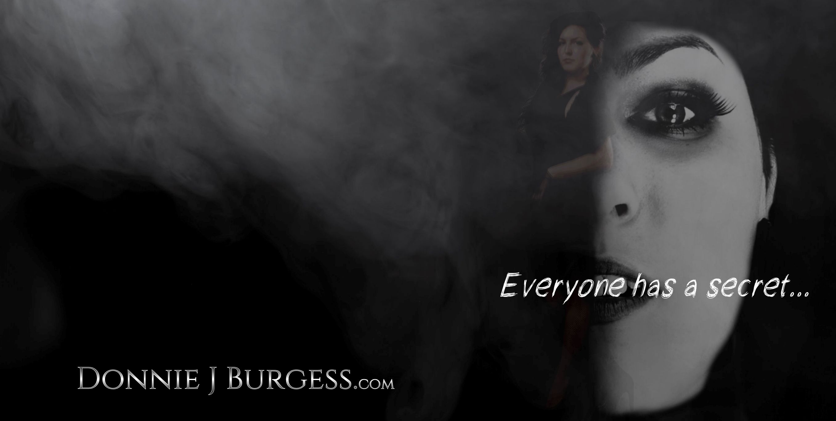
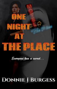
When I began thinking about removing the hotel sign, I had to start thinking about keeping the existing title. After trying it both ways, I ultimately went with the initial title. I spent a lot hours trying out different fonts, colors, etc. while putting together the final cover. I think the result is pretty darn good. It passes the thumbnail test, it doesn’t have anything (except the title) to hint at vampires, and the kindle version (below) looks every bit as good as the print version (from the top of this page).
I only wish I had spent this amount of time working it all out before releasing the book instead of a year later…